Dried Fruits
Brand identity, Labeling, Packaging
©THE KIN DEE CO
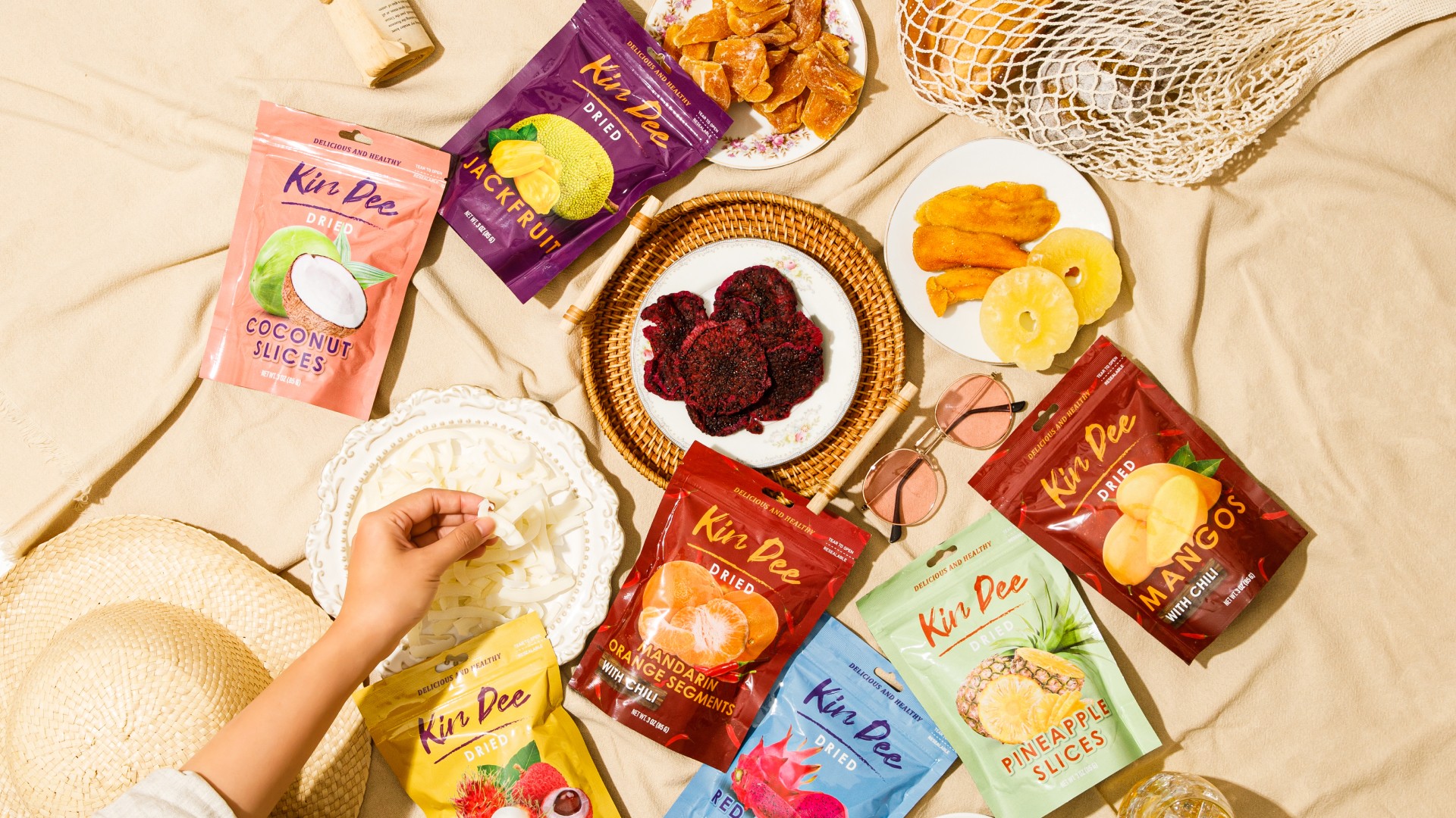
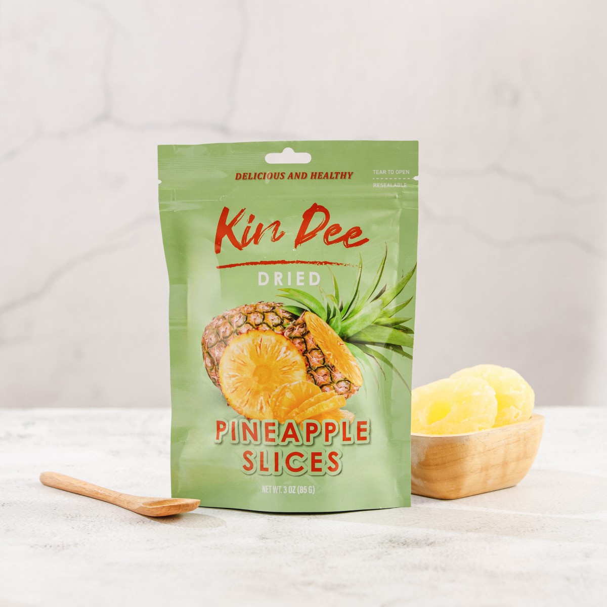
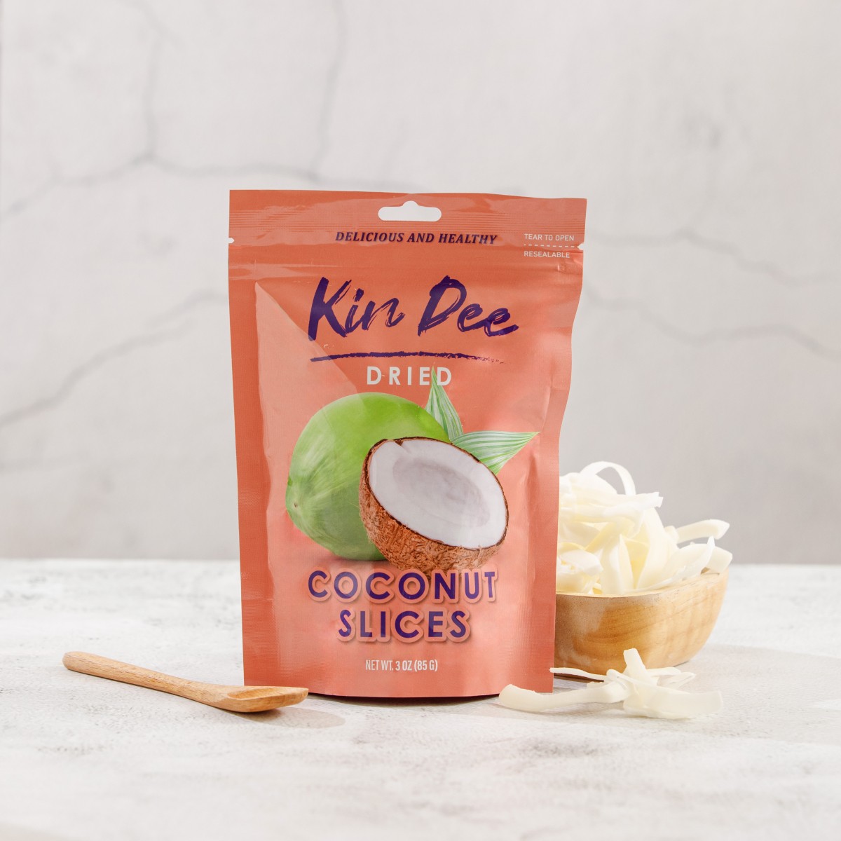
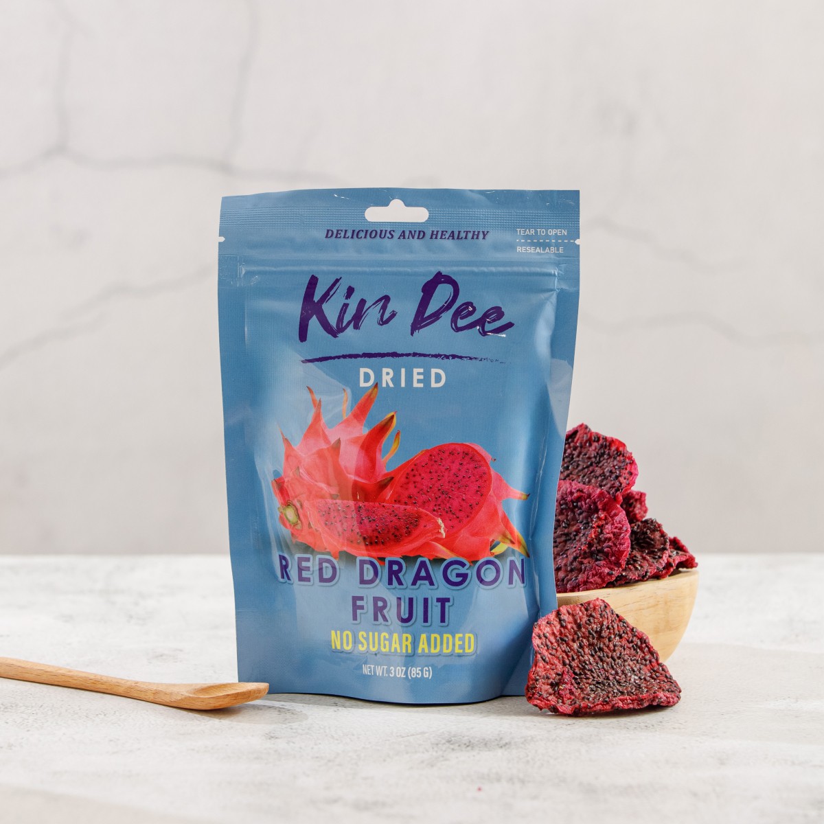
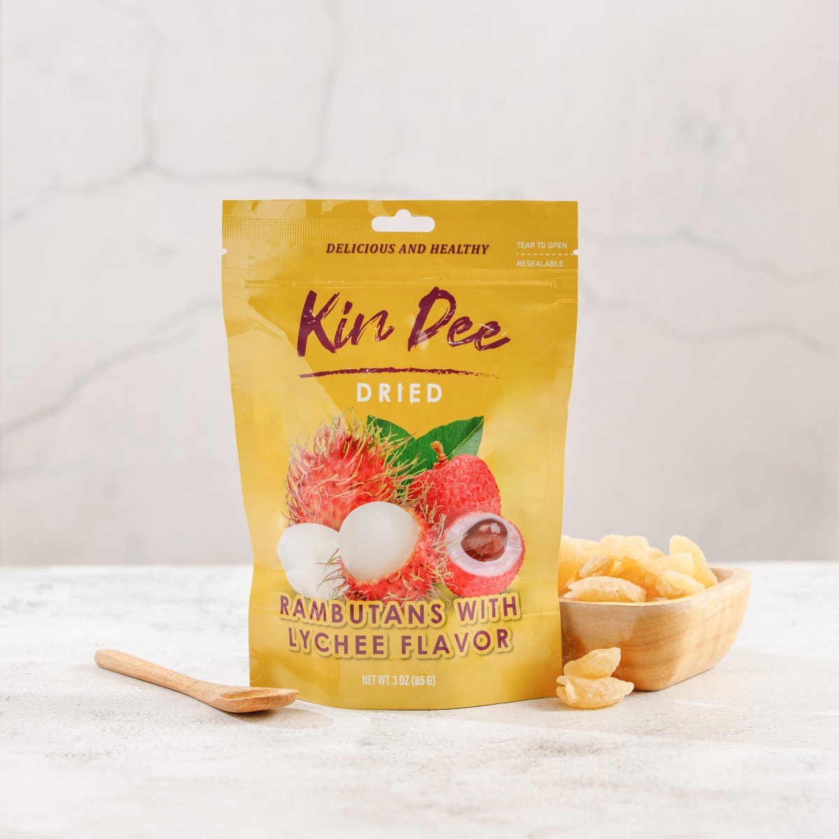
The "Kin Dee" dried fruit packaging brings vibrant, tropical colors and bold typography together, instantly grabbing attention on the shelves. Each product is wrapped in its own distinct color palette, reflecting the unique flavor and personality of the fruit inside. From bright oranges and purples to soothing pastels, these colors evoke the freshness and natural essence of the dried fruits, while also providing easy differentiation between flavors.
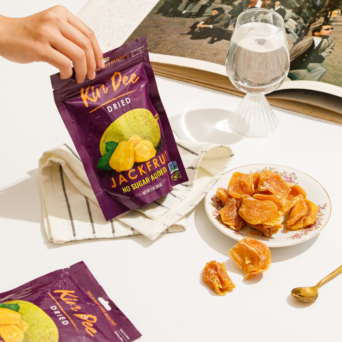
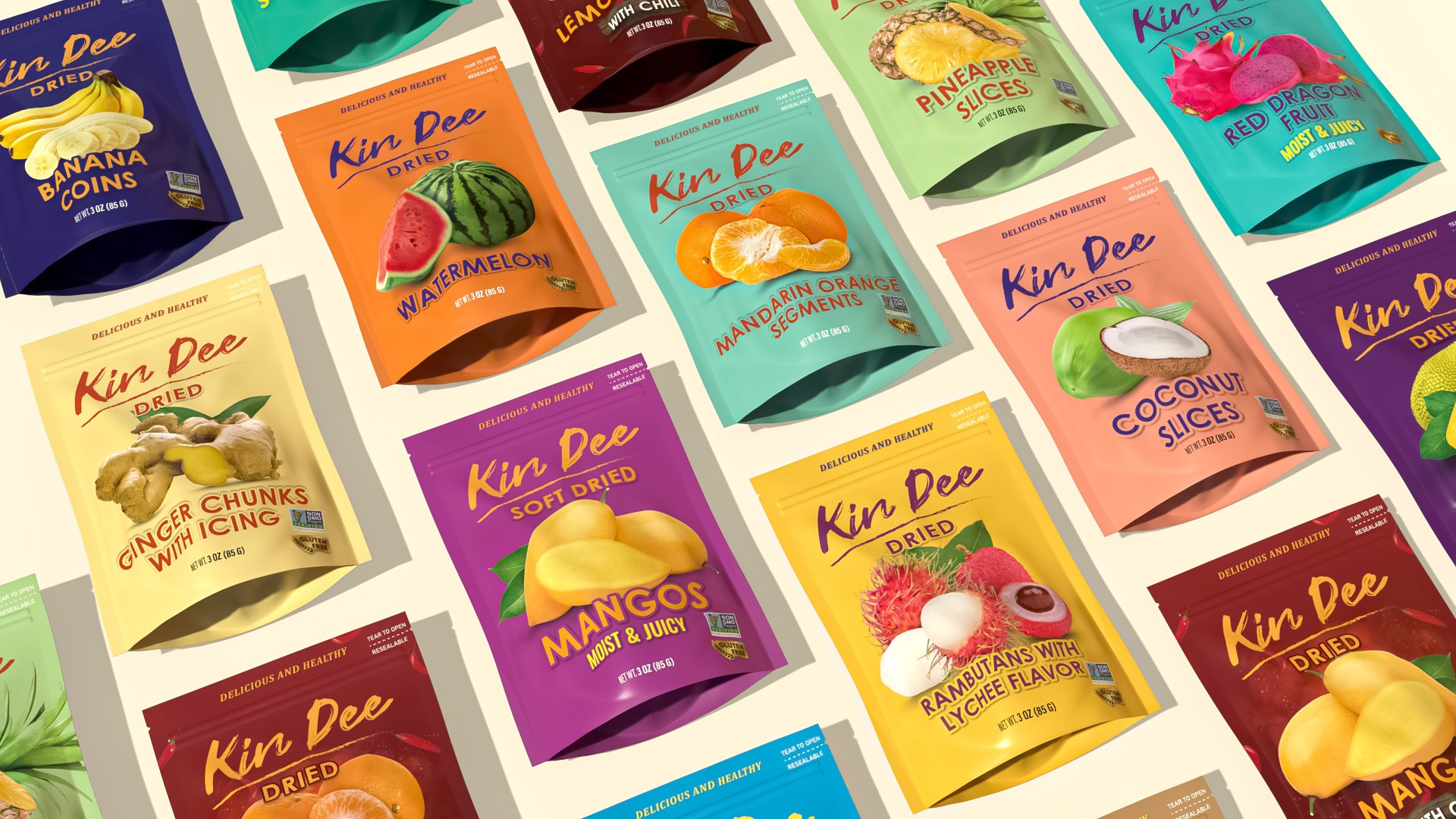
The prominent "Kin Dee" logo is showcased in an elegant, hand-written style, giving the brand a friendly and approachable feel, while the bold, all-caps typeface used for the fruit names ensures clarity and readability. This combination strikes a balance between modern appeal and traditional quality, making it attractive to both younger consumers and those seeking natural, healthy snacks.
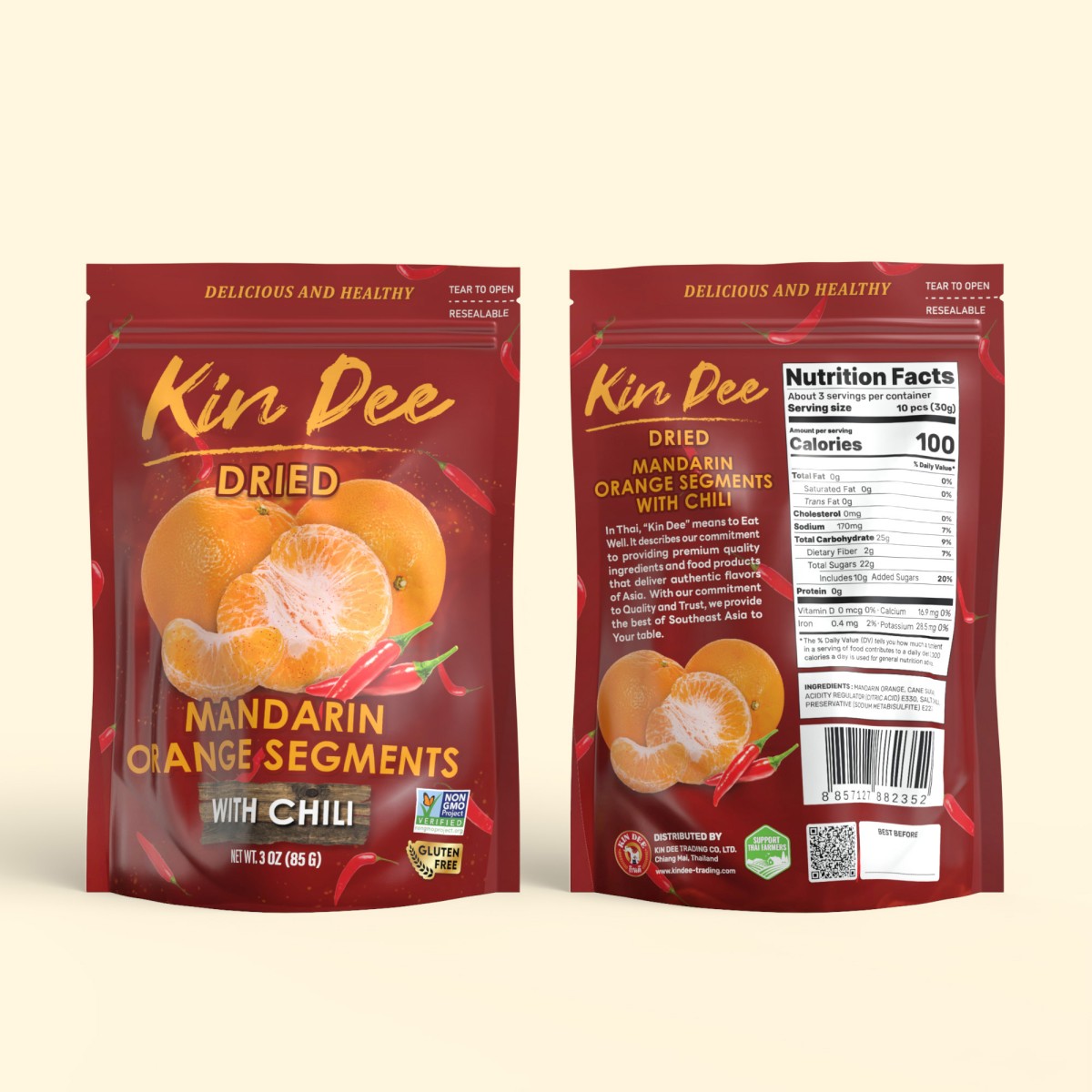
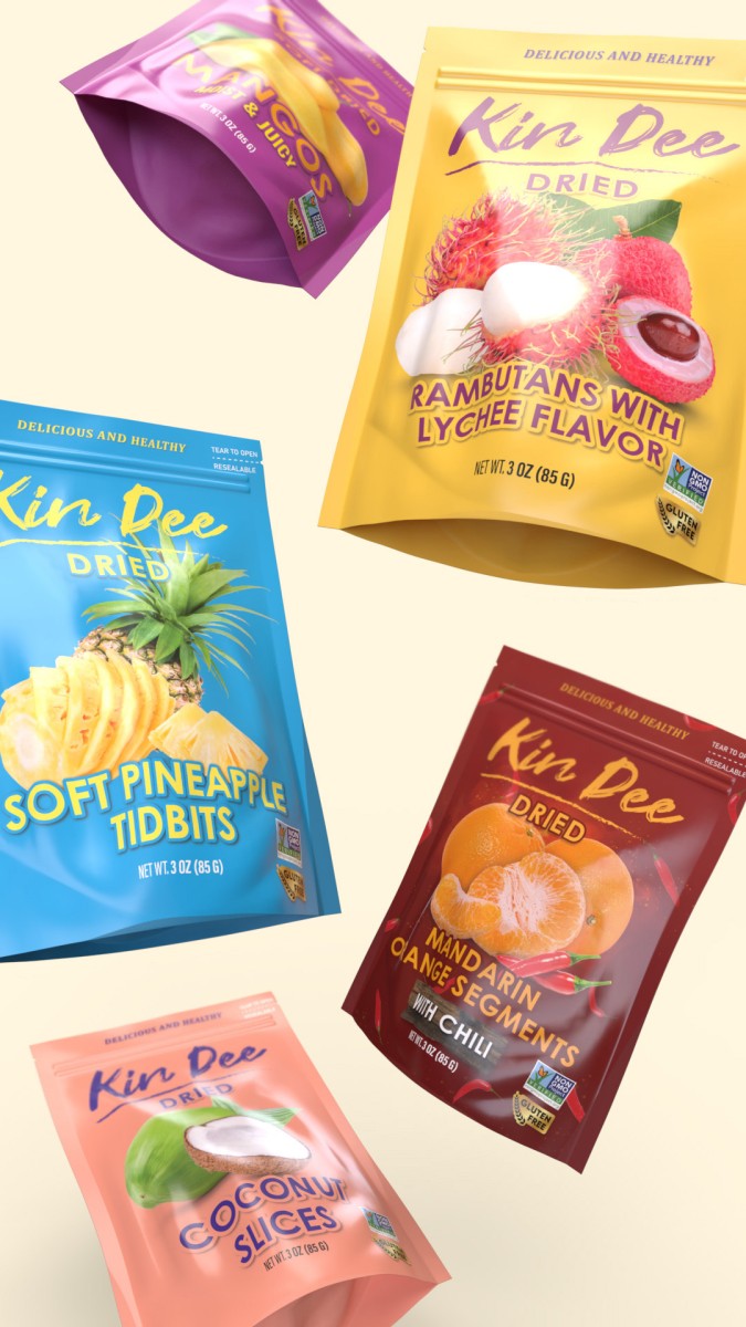
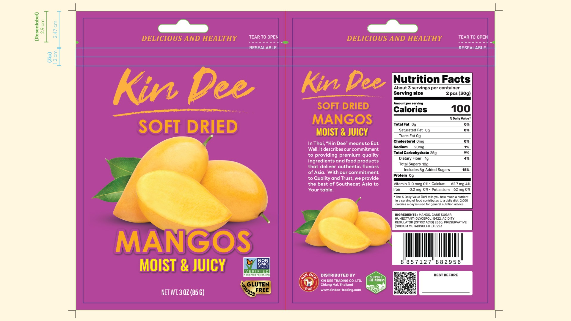
The resealable packaging is not only practical but also reflects the brand’s commitment to convenience and quality, ensuring that the product remains fresh for longer periods.
Tools
Illustrator
Design
Photoshop
Design
Dimension
3D Model & Mockup