Ready-to-eat Rice
Brand identity, Labeling, Packaging
©THE KIN DEE CO

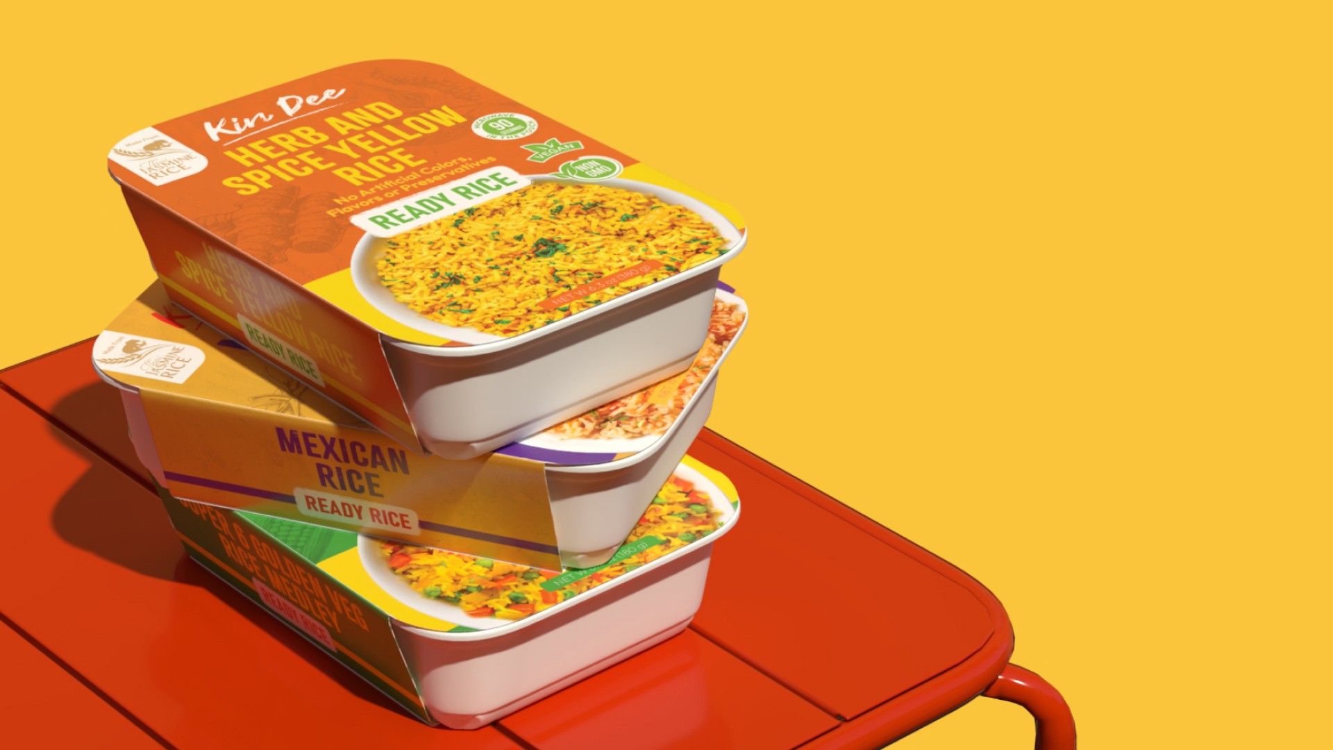
The "Kin Dee Ready Rice" packaging series offers a modern and vibrant approach that instantly grabs the consumer’s attention. Each flavor is represented by a distinct color palette, making it easy for customers to differentiate between varieties at a glance. From warm yellows and greens to rich purples and oranges, the color schemes reflect the natural ingredients and unique spices used in each rice variety, emphasizing freshness and flavor.


The design is centered around a bold, clean layout. The product name is large and easy to read, accompanied by clear descriptors like "Vegan" and "Non-GMO," which appeal to health-conscious consumers. Additionally, the microwave-ready feature is emphasized with the “90 seconds” icon, highlighting the convenience of the product for busy lifestyles.


Each package features a high-quality image of the prepared rice, giving consumers a visual sense of what they can expect inside. The rice is presented in a clean, white bowl, emphasizing the freshness and delicious appeal of the product. The use of natural, no artificial flavors or preservatives, is clearly noted, reinforcing the product’s commitment to quality ingredients.
Tools
Illustrator
Design
Photoshop
Design
Dimension
3D Model & Mockup