Sriracha Sauce
Brand identity, Labeling, Packaging
©THE KIN DEE CO

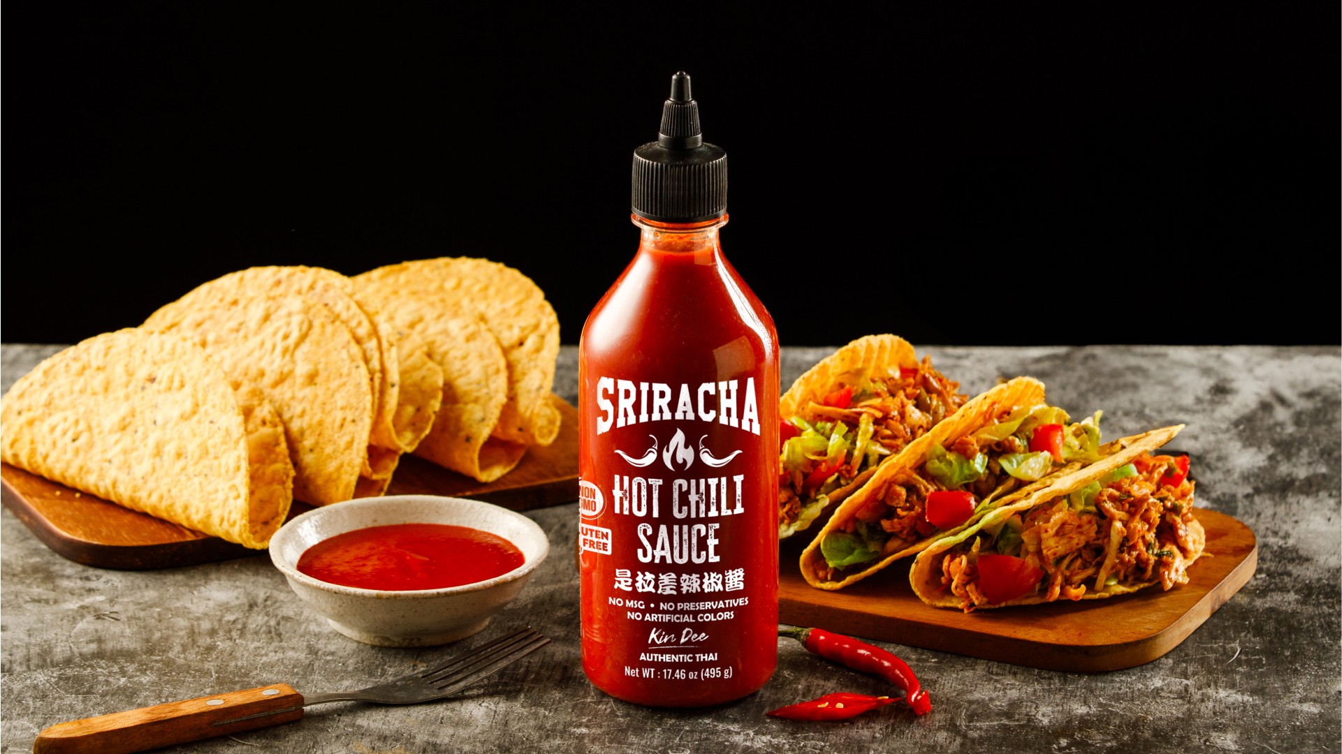
Sriracha Hot Chili Sauce packaging exudes boldness and authenticity, reflecting the fiery and flavorful nature of the sauce inside. The bottle is a clean and sleek design, with the bright, rich red color of the sauce taking center stage, instantly communicating the heat and intensity that Sriracha is known for.


The bold white typography used for the product name, "SRIRACHA HOT CHILI SAUCE," contrasts sharply against the red background, making the label easy to read and visually impactful. The flames and chili illustrations around the text reinforce the spiciness of the product, ensuring the consumer knows they’re in for a hot, flavorful experience.
The minimalist design, with its clean layout and straightforward messaging, aligns with the bold, no-nonsense attitude of the product, making it both practical and aesthetically striking.
Tools
Illustrator
Design
Photoshop
Design
Dimension
3D Model & Mockup